My Practical Accessibility Plan

I love to share my passion for accessibility. There is something incredibly satisifying about kicking down barriers to information. I’m inspired by the goals of the W3C, “Web for everyone. Web on everything.”

With this in mind, I wanted to share my own practical accessibility practice. When asked to test a site for accessibility, these are the steps that Glenda the Goodwitch takes:
No Place Like Home: UT Home Page Modernized

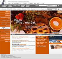
I have a dream…that the UT Home Page will be modernized. It has been over 3 years since our last major redesign, and while the information design, branding and content are still on the mark, there is plenty of room for technical improvements. (Lord, isn’t that always true?)

Now my dream is coming true! So, for your preview pleasure,

AIR High – Accessibility in High School

Ahhhhh….High School. So many life lessons learned. So many memories forever tattooed in your psyche. What a great moment in time to be immersed in the web and accessibility. What? Teach web accessibility to high school teachers and students? Yep, that is exactly what we are doin’ right here in Texas.

Touching Art

Have you ever heard of an art exhibit where you are allowed to use your hands as much as your eyes? My recent trek to see Shade: Art Beyond Sight elevated the sense of touch above vision, and was specifically designed from an “eyes closed” perspective. Tactile drawings, touchable objects, braille labels and audio descriptions created a multi-sensory experience.

Color Alone

Are you using color alone to convey information? I was. I prefer my links with text-decoration: none. So, how can you tell if something is a link? By color alone! Uh oh. Yes, I just changed the css on this blog to include border-bottom: 1px dotted gray for links.